Showing posts with label Decor. Show all posts

Saturday, October 22, 2016

Spicy Red Spice Racks


I haven't posted any home improvements for a while, mostly because I haven't done very many.  :(  However, I'm pretty proud of my new spice racks. I officially hung them on August 7th and have been using them long enough to declare that a) They are awesome. and b) They have made my countertops much more organized. 

The reason for the spice racks?  Well, I have kind of a lot of spices and extracts.  Not as many as some people, but more than just the basics.  Which means that the nifty vintage Watkins Spices rack that I bought at an estate sale *definitely* didn't hold everything.  The bottles and jars took up some space, but they also tended to meander around on the counter and every time I wanted to clean the counter, it was really annoying to move them all.  Plus, they were perpetually falling over.  

When I started looking for spice racks, they were all fairly expensive and none of them were what I wanted.  I finally found something workable at Ikea, the Bekvam spice racks. At a mere $3.99 each, they are what I will call "super-cheap."  They are also real wood and can easily be customized.  
        
Like all Ikea things, the spice racks come flat-packed and need assembly.  So, I unpacked the pieces and assembled them.  You don't need any tools; a little wrench thing is included in the packaging.  You do, however, have to figure out one of the standard, slightly confusing Ikea drawings, because there aren't any actual words in the directions.  Luckily, though, this is a spice rack and not a huge piece of furniture!  


After I assembled my two spice racks, I spray painted them (with a glossy red Rustoleum).  It took 3 coats to get a nice, even, shiny red.  Yeah, I should probably have sanded them first, but honestly I didn't think about it at the time.  So....oh, well!


After they were completely dry, I hung them up in my kitchen.  The tricky parts were avoiding my electrical outlet, hanging them individually straight, and hanging both in an even line...all while working right underneath my cabinets and standing on a chair because I have short arms.  As you can see, there is a bit of space between them, but I think they turned out just fine!


Sunday, June 14, 2015

Cross-Stitched Design: pillow featuring a snarky and cool Firefly quote


Quite a while ago, I noticed that there were people cross-stitching fun phrases or samplers onto things and then selling them on etsy and places like that.  In particular, I always thought that the juxtaposition of phrases with bad language in them that used really pretty, flowery letters were pretty funny.  I also really like that some people have made their pop culture favorites cross with their stitching hobby.

For a friend for Christmas, I decided to do the latter.  Since she is a big Firefly/Serenity fan, I decided to use the Captain Malcolm Reynolds quote "I swear by my pretty floral bonnet, I will end you"(while wearing a floral bonnet, obviously!).  I made up the pattern for the cross-stitch myself, using some graph paper, a pencil and two websites for inspiration: an online site with fonts that helps with spacing for words and a site that had a few floral corner patterns for me to improvise off of.

After the design and sewing parts were done, I gave it to my friend for Christmas and then I asked my friend if she wanted it framed or made into a pillow.  She went with the pillow (smart choice!), which meant that I had to figure out how to do that.  After a bit of research, I decided to go with something that would frame the stitching in front and would have a flap/envelope in the back.  Basically, so that the pillow would look nice, but wouldn't require a zipper or to be sewn closed.

I managed to finally get the pillow finished by May...it took a while but it turned out really well.

I looked at a lot of instructions online, but the most useful pages I found were these two:


Basic steps were:
  • Iron (on the reverse), then measure and cut the panel for the front
  • Iron, then draw out pattern on blue fabric for the "frame" on the front of the pillow
  • Cut out frame pieces
  • One at a time, pin and sew frame pieces to the front center panel 
  • Then sew angled corners together to complete the frame
  • Iron corners so that they lay flat

  • Cut out two pieces for the back
  • Sew the edges of the envelope in the back pieces
  • Lay back pieces and front piece out, right sides together
  • Sew back and front together
  • Turn pillow/cushion case right-side out and insert 12 X 12 inch pillow
  • Finished!


Sunday, May 31, 2015

Matching Flower Pots: Variations on a theme!


Last year I did some container gardening, with a whole bunch of pots on my back deck.  It was pretty fun and I wanted to do it again this year, but I also wanted this year's set of plantings to help make my back porch/deck a bit classier.  Last year was for experimentation, but this year is for the cool version, or so I told myself.  I figured that the best--read that cheapest and easiest--way to do this was to color coordinate my flower pots.  Since last year I had a turquoise seat cushion and matching turquoise holders for my movable lights, this seemed like a legit choice for a color scheme. 

So, I went to the home improvement store and bought a can of ridiculously bright turquoise spray paint.  I went with a glossy Rust-oleum paint that is advertised to adhere to plastic and work well outside.  Then I rounded up the planters and pots that I wanted to use, spread them out on a plastic drop cloth in my garage (it was raining outside) and started painting.  Oh, yeah.  And I decided that it would be super-fun to have my tomato cages match my planters, so I painted them, too.  
To get a nice, even finish, I needed at least two coats of paint and a few pieces needed three.  I also painted the sides and bottoms first, then flipped them up and painted the tops and inside edges.  All this crazy painting meant that I ended up going back to get a second can of spray paint.  I forgot to write down the name of the color, but luckily the one I picked was such a wild and notable color that I didn't have to worry about getting the wrong color of turquoise on that second store trip!  
  

I painted almost all of the pots/planters, with the exception of two of my four smaller pots that were a darker turquoise already. I left these their original color to add what I'm thinking of as a "sophisticated color contrast."  And then when I think that, I laugh inside.  :)  

After the base coat was done, I decided to add some more "sophisticated color contrast" [hehehe!] to a few other pots.  These were the terra cotta and plastic pots and saucers for my hanging plant holder.  For these, I bought a sample of a contrasting color of paint.  I could have gone to a craft store, but those are far away.  For less than the price of the gas for a round trip drive to a craft store plus the cost of a small bottle of craft paint ($3.75 to be more exact), I bought a small jar of lighter turquoise Behr Satin Gloss house paint.  I used that to paint some designs on the terra cotta pots (some free-hand and some with painters tape) and saucers, and to paint one plastic pot completely.  Fun note, painting the plastic using a sponge brush made it more textured and suddenly it looked like a ceramic pot, rather than a cheap $1 plastic version.  Cool, huh?  


After the designs were done, I coated the pots and saucers with 3 coats of indoor/outdoor glossy varnish (left-over from use in my Coaster and Glitter Shoes projects, actually). Then they were ready for planting.  Here are a few pictures, but you can see even more of my new and *very* sophisticated porch decor in my up-coming post about this year's container gardening.     

Thursday, January 8, 2015

DIY customized "white" board: Fancy and utiliarian


I wrote before about my salon-style wall with lots of different frame sizes, types, designs, etc. One of the things I definitely wanted on this wall from the beginning was a chalkboard.  Mostly because it would be a utilitarian thing.  

I used chalkboard paint in one of my homes in grad school.  I painted several large-ish cardboard rectangles, which I interspersed with same-sized cardboard rectangles covered with brightly colored, patterned fabric from the $1 clearance bin.  This made for a cheap and amazing wall.  It was decorative and utilitarian.  My roommate and I wrote grocery lists, to do lists, and who owed who money from recent shopping/outings.  I loved it!  However, the one problem was that the cardboard was not a very long-term base for a chalkboard.  It soaked up a ton of paint and lasted great for a year, but was never meant to be forever.  

For my grown-up house, I wanted something more durable, so I figured I would paint my chalkboard over the glass already in a large frame.  However, the difficulty of getting cheap chalkbaord paint that I knew would stick to glass made me change my mind a bit. (There is a special kind of chalkboard paint for glass, but it is normally sold in tiny bottles for use on glassware.) I also started thinking about having chalk dust flying around and ultimately decided to go in another direction: custom "white" board. 

One of the fun things about white board markers is that they work well on all kinds of slick surfaces, including glass.  Ever see a mathematician or a crime-solver writing on windows or glass walls on TV or in a movie?  That's what I'm talking about.  

The one thing is that it can be hard to read markers on glass, because of the transparency factor.  Opaque boards have the advantage on this front.  But I also had two issues: 1) I didn't want to pay for white board material and 2) I didn't want to use anything that was hard to cut to fit in my frame.

I came up with a solution that is working really well for me:
  1. I already had a large frame with nice glass in it that would work well.  (I got it from my mom.  She was going to donate a bunch of old frames to the Goodwill, but a few were diverted to me.)  My frame is about 16 X 20 and I spray-painted it to match the rest of the frames on my frame-wall.  
  2. Bought a piece of poster board ($0.50 at the Dollar Tree) and cut it to fit inside my frame, right up against the glass. 
  3. Found a fabric for the background that was cheap, attractive, and not too busy.  You could use any plain color, light pattern, etc., but I bought a silver-on-silver floral patterned fabric from the clearance rack at my local Hancock Fabrics.  It clocked in at about $2.50 a yard and 3/4 yard was more than enough.
  4. Tightly covered my poster board rectangle with the fabric, folding the extra to the back and securing with tape.  
  5. Put the fabric covered rectangle in the frame like a photo and then closed the whole thing up. 
  6. Custom "white" board finished and ready to use! 

Cost for the customization:
  • Frame--Free 
  • Spray Paint--$4 (but also part of a larger project)
  • Poster Board--$0.50
  • Fabric -- under $2
  • Total--Under $7!


Monday, January 5, 2015

Use a Coaster Already!


One of my friends has a really nice, really large table that is perfect for board games and a big crowd of fun people.  He--very reasonably--wants people to use coasters for their drinks to keep the table nice.  However, he only had two kinds of coasters: disposable cardboard ones (think bar coasters) that somehow keep getting reused and old, cool ones from his mom that are perfect for bottles or cans but are a little small and uneven for mugs, glasses, etc.

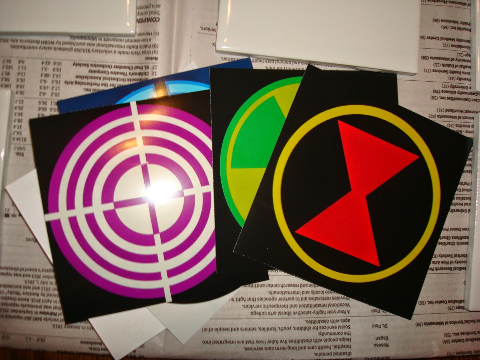
To solve this lack-of-appropriate-coaster issue, I decided to make him a set of customized coasters that would work for any beverage.  His set of 6 would be from the Avengers, because he freaking loves the Marvel cinematic universe and insisted that we watch the movies all in order before we could go see The Guardians of the Galaxy.  (Somehow he thought we wouldn't understand GofG without seeing the other movies.  No so much, really, though there were a few inside-moments that built on things from the other films....anyway...)

To make the coasters I first needed supplies:


  • The base of the coasters were 4.25 inch square white tiles from the Home Depot.  They cost somewhere in the range of 20 cents each and I bought an extra, just in case.  
  • The images I painstakingly made in a simple Paint program (because that is what I have) and then I had them printed on photo paper at my local Target.  I made sure that my images would be exact squares that would fit on 4inch by 6inch photo paper. There was an issue initially with the very edges of my emblems getting cut off, and I had to resize and do them again.  The best way seemed to be making the image square, printing it on rectangle paper, and then trimming it down to the square I wanted.  
  • I purchased Mod Podge, both to glue the images onto the tiles and to create an initial layer on the top of the coaster.  I used glossy.  However, it is important to note that Mod Podge is not waterproof.  So for coasters that are not just decorative, you need a more waterproof topcoat.
  • I bought a Ceramcoat gloss exterior/interior varnish for the actual topcoat layers, figuring that anything meant to protect outdoors could probably stand up to some condensation from glassware.  
  • For padding on the bottom of the coasters--so that they wouldn't scratch the table whist providing protection from water-rings--I get some self-adhesive felt.  Fuzzy on one side and sticky on the other.  
  • I used a foam brush, though other kinds of brushes might have put fewer texture lines in the glossy finishes.  

Here is my process:

1.  Cut images to be 4inch squares. Hint: use a paper-cutter to get a nice straight line.
2. Lay out tiles on newspaper so that you can work quickly and efficiently.
3.  Coat the reverse side of the image with an even coating of the ModPodge and affix to tile, centering it and smoothing out any bubbles, extra glue, etc.
4.  Coat with multiple coats of ModPodge, being sure to make it as even as possible and not forgetting to coat the edges.  The ModPodge goes on opaque white, but dries clear. See Capt. America image below.  Also, be sure to let the ModPodge dry completely between layers.  With my house's heat on, the coats dried very quickly.  Also, be sure to pick up tiles after a layer is dry so that they don't stick to the newsprint.  If some sticks on, just rub or smooth it off the bottom and/or edges
5. When the last ModPodge layer is dry (I did 3 layers), start layering on the varnish layers.  (I added 3 varnish layers, too.)  Again, make sure one coat is dry before adding the next. 
6. When all the coating layers are finished, make sure to let them dry/cure out.  I let mine do so for the afternoon and then overnight.  
7. The final step is adding the felt to the reverse side. I cut the felt into squares just smaller than the 4.25 inch tiles...approximately the same size as my images on the top side.  
8.Even though my felt had an adhesive layer, I added a bead of superglue to each corner, just for added security. 
9.And there you have it, a customized set of utilitarian coasters.  Form and function unite!!


Sunday, November 16, 2014

Halloween Papercrafting


I'm still working on my pre-Halloween catch-up for my projects... and here's one of them:

In order to add a little Halloween flair to my salon picture-frame wall, I needed a few cool and appropriately themed images.  I filled some of the frames with creepy art that I love, but the rest I filled with some fun paper art that I...MADE MYSELF!  Some were free-handed (Frankenstein), others are from direct patterns for paper-crafting (the rats and the cat), and one was from a pumpkin carving pattern (the wolf howling).  All in all a very satisfying afternoon of work.

Oh!  A tip for doing this sort of papercrafting: Find small scissors.  I actually bought a nail set at the dollar store that included a small set of straight scissors and they worked perfectly for this sort of thing.  


Saturday, November 8, 2014

Poetry Pumpkin


This Halloween I decided that I would do a few projects that would be crafty but festive for my house.  I found all sorts of amazing things on Pinterest, including the idea of using sharpies to decorate pumpkins for indoor use.  Some people just drew on their pumpkins, some people wrote on their pumpkins, and some people did both (see below).  The basic idea is just to spray paint the pumpkin and then get creative with your sharpie pens!  


My pumpkin was also obviously silver, rather than white.  Mostly because I had silver spray paint already and thought it would look cooler.  I like the way it turned out, but writing on the silver was more difficult than it would have been if I had used a matte color spray paint.  It was also probably harder to read.  


As for what to put on the pumpkin: I can't really draw very well, but the idea of poetry on a pumpkin seemed perfect for me, what with my love of books and all.  I love, love, love Poe's poetry...and basically everything he ever wrote.  However, I already had a passage from Edgar Allan Poe hanging on my wall, so I decided to go for something a bit different: Henry Wadsworth Longfellow's "Haunted Houses."  

I think that my decorative indoor pumpkin turned out really well.  I made sure to pick a pumpkin that was whole and firm, with no soft or damaged spots.  I also made sure it had an appropriately nifty stem, which I covered with newspaper during the painting process.  I spray-painted it (two coats) about a week and a half before Halloween and it was still in good shape over a week after.      

Here is the poem I used, if you're interested:  

Haunted Houses
 All houses wherein men have lived and died
Are haunted houses. Through the open doors
The harmless phantoms on their errands glide,
With feet that make no sound upon the floors.

We meet them at the door-way, on the stair,
Along the passages they come and go,
Impalpable impressions on the air,
A sense of something moving to and fro.

There are more guests at table than the hosts
Invited; the illuminated hall
Is thronged with quiet, inoffensive ghosts,
As silent as the pictures on the wall.

The stranger at my fireside cannot see
The forms I see, nor hear the sounds I hear;
He but perceives what is; while unto me
All that has been is visible and clear.

We have no title-deeds to house or lands;
Owners and occupants of earlier dates
From graves forgotten stretch their dusty hands,
And hold in mortmain still their old estates.

The spirit-world around this world of sense
Floats like an atmosphere, and everywhere
Wafts through these earthly mists and vapours dense
A vital breath of more ethereal air.

Our little lives are kept in equipoise
By opposite attractions and desires;
The struggle of the instinct that enjoys,
And the more noble instinct that aspires.

These perturbations, this perpetual jar
Of earthly wants and aspirations high,
Come from the influence of an unseen star
An undiscovered planet in our sky.

And as the moon from some dark gate of cloud
Throws o’er the sea a floating bridge of light,
Across whose trembling planks our fancies crowd
Into the realm of mystery and night,—

So from the world of spirits there descends
A bridge of light, connecting it with this,
O’er whose unsteady floor, that sways and bends,
Wander our thoughts above the dark abyss.


Sunday, October 5, 2014

Wall o' Awesome aka Salon-Style Display of Framed Items


I have this wall in my house that is sort of betwixt-and-between.  It creates a sort of faux-hallway connecting my kitchen to my dining area and living room.  I have been thinking for a long time that a salon-style display would be perfect.  (You know, like in old European homes and museums, where frames of all kinds are hung close together, filling whole walls and showing off a huge amount of art all at once.)  Even though this was clearly a great idea, I hadn't really gotten around to trying to do anything, so the wall had been unadorned...until last Christmas.  I used the wall as a place to hang my holiday cards and a variety of winter/Christmas themed words cut out of fancy scrapbook papers. 

That wall looked totally awesome and I loved it!

And then came mid- January, when I could no longer pretend that keeping my bright and cheery decorations up was cool with the world as a whole.  (Ok, yeah. You're right.  It might have been late January.)  After the cards and the brightly colored words came down, the wall was just so....bland.  I started thinking of things I could do with it and I finally decided that the jammed together look was actually a good one.  You see the wall as you walk by it, but it faces in such a way that doing an old-world gallery/salon display wouldn't clutter up an actual room.  

After deciding to do this cool project, I needed to decide what would go on this wall.  I decided on two main utilitarian features: a whiteboard and a keyring holder (which I will describe in future posts).  The I had to find the components for my wall: a wide variety of sizes and styles of picture frames.  

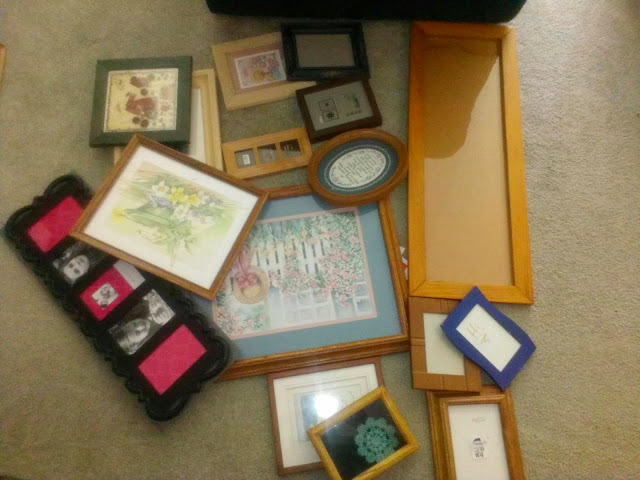
The largest frame was for the whiteboard, and I got it and some others from my mom, who was cleaning out her house.  A fancy-looking-but-made-of-plastic frame  was purchased on clearance and with a coupon from Kohl's.  And all the others were purchased for super-cheap from thrift stores.  I just kept my eyes open for interesting designs, shapes, etc.  Condition didn't matter so much, because I knew that I would be painting them.  And what was in them was completely irrelevant because I wanted to put my own stuff in the frames, anyway.  (The oval frame was a particularly good find, but it had a religious poem in it that had the store selling it as "art" and not just the frame.)  The Kohl's frame was $6, but most were in the $1 to $1.50 range and I'm pretty sure that the most paid for any other frame was $3.00.  Here they all are:


Once I had the frames, I needed to make them look like they belonged together.  I thought about painting them all the same color, but then decided that wasn't the best option.  Instead I purchased 3 different spray paints: a pale grey, a darker grey, and a metallic silver.  The paint I used was a Rustoleum paint+primer that would stick to metal, wood, plastic, etc. 

I took the frames apart, and for those that I couldn't get the glass out of, I covered the glass with paper and scotch tape.  


I decided what color to paint each of the frames, then laid them out on a drop-cloth on my garage floor.  And I opened the garage door, obviously.  


I then spray painted the frames with 2 to 3 coats each.  I tried to do light coats, but I'm not a super-proficient spray-painter at this point, so they were probably heavier than I should have done.  I let them dry for a full day, then moved them inside and let them cure out some more.  


Before I painted the frames, I cut paper shapes (out of old wrapping paper) for each. Then I used them to plan the set-up of the wall.  Here's the plan, in situ:


After getting everything painted and planned, I purchased a variety of 3M Command picture hangers.  They work sort of like locking velcro, but come off the walls and frames like the Command poster adhesives I used in college.  The idea behind the purchase being that they would allow me to keep from putting tons and tons or holes in my wall.  In addition, since they are supposed to be long-lasting, I should be able to take the frames down and change the imagery fairly frequently.  

After getting the hangers up, it was October and time for Halloween decorations.  So instead of putting regular photos and images in the frames, I put creepy artwork (including Munch's "Vampire," Delaroche's "The Execution of Lady Jane Grey," and Fuseli's "Nightmare"), an Edgar Allan Poe "Raven" excerpt, and some paper-crafted stuff (fangs, werewolf, Frankenstein, a black cat, etc.).  

The final project is at the top of this blog post.   My finished, custom gallery wall.  I love it and it will be a great way of displaying photos, art prints/postcards gathered on museum visits, and other stuff that I want to be able to see and share.  


Sunday, September 21, 2014

Almost Instant Hutch Update: Green is the New Orange!


An extremely generous co-worker and friend gave me a hutch several months ago.  I absolutely loved it, and not just because of the low, low price point!  It is beautiful, with two glass shelves, a light, and windowed doors in a top area that is perfect for displaying breakables like my hurricane lanterns and some of my great-grandmother's china.  On bottom there is a solid single-doored area for storage.  It is an old-fashioned and genuinely lovely piece of furniture.


OK, except for one thing: at some point someone painted the original back of the hutch orange.  Really, really orange.  And streaky, because they didn't spring for multiple coats of paint to get it even.

I lived with the orange for a while, thinking I would paint the back when I made some other decisions about painting my cheap living room furniture.

Eventually, I realized that I didn't want to do what the previous owners did.  Just painting over the orange wouldn't bring back the niceness of wood grain, and if I wanted to change it later I would just be adding more coats of paint.

Enter my genius plan: cover the orange with fabric!  I found a great microsuede-like fabric in a dark green that was very similar to the fabric covering my living room chair and ottoman.  I used simple push pins (though I had to hammer them into the hard wood) to attach it, then put the glass shelves back into their original positions.  I think it turned out really nice.  It is colored, but is sort of neautral in that coloring...and I can change it quickly and easily anytime I want to!